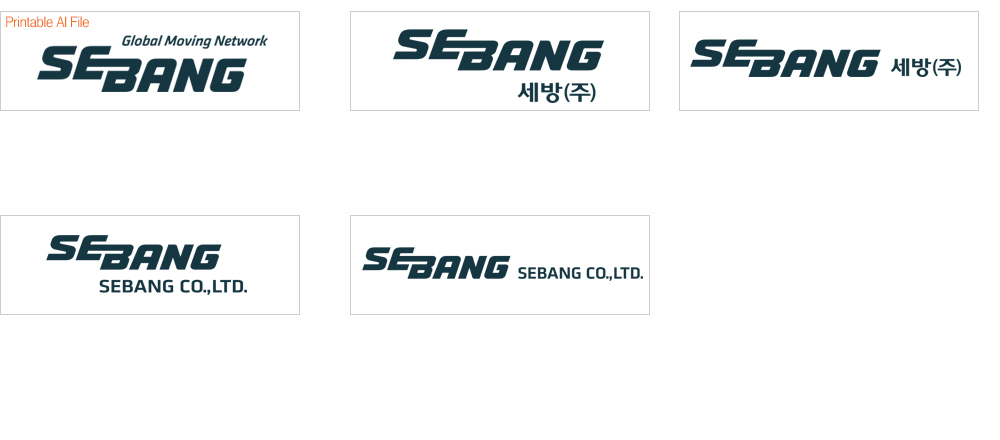
Our new slogan ‘Global Moving Network’ and corporate symbol are the new face of SEBANG. They embody the image of SEBANG, moving the world and becoming one through a network.
Our new corporate symbol is a unified logo, made with the two colors of SEBANG Orange and SEBANG Blue. The curved typeface represents our promise to become a soft, refined, and relaxing company, while avoiding authoritative and conservative attitudes.
The slanted form represents SEBANG’s changing image and speed, as well as the image of expanding into the world. The symbols ‘E’ and ‘B’, symbolizing Extensive Bound, represent SEBANG’s vision and core value of worldly expansion through dynamic strength and expanded movement, denoting the unification of the world under SEBANG’s logistics network.
SEBANG’s CI delivers the will of Change, Challenge, and Globalization, and will serve as the motivation for SEBANG to become a company standing tall in the middle of global logistics.